Saturday, March 27, 2010

Basil of Baker Street, Part 3


My wife and I made hurried plans for a trip to London to gather reference for the film.We contacted Eva Redfern who managed the Disney Studio in our London branch and she worked tirelessly to set up the things we requested. Paramount to our quest for reference was a trip inside Big Ben itself. Security was and probably still is very tight around Big Ben as it is not only a famous London landmark but is considered part of the Palace of Westminister. We took our video equipment up those steps into the bell chamber. In those days, video equipment was heavy and in multiple pieces (camera and recording deck). After trudging up never ending sets of stairs, we found ourselves literally standing behind the huge face of Big Ben's milky white glass face. 


A reference shot I took just behind the
huge white clock faces of Big Ben
When the unseen bells were struck by the hammers above us, the tower actually vibrated with the sound. After that treat we then crawled up and lifted a sort of trap door with a pillow on top and found ourselves face to face within the bell chamber including the big one, BIG BEN. While being up in the bell chamber, we only had about 10 minutes to snap pictures and run video before the bells would chime on the quarter hour. Being close to noon, we knew we were in for some real ear splitting harmony and the ear muffs were very welcome. We spent the afternoon going inside, outside and around the structure until we were sure we had plenty of reference material of the tower for my needs as well as the crew back home.

One of the hundreds of photos
I took laying on the ground to
get a "mouse's point of view"
We must have been quite a sight to the British as I was perpetually lying down on the ground trying to get Basil's 6 inch high POV of London with my Nikon lens. We performed the same antics in front of Buckingham Palace,Tower Bridge and everywhere else that our brave intrepid little mouse might travel. Patty and I spent a late night in the East End of London because at that time it was filled with dilapidated buidings bordering the waterfront dating back to the Victorian age and beyond which was perfect for the Ratigan section. When the tube stopped off in Whitechapel, Patty and I were the only ones to step off into a deserted station. During our quest we also crossed the footsteps of Jack the Ripper while taking our photos. We became uneasy as we realized that we were alone in a deadend rundown section of cobblestone. The cabs didn't come to this part of town so we starting walking to the nearest tube which wasn't as close as we were hoping. As our imaginations kicked in, our pace got quicker until we eventually found ourselves safe and warm in our B&B back in Kensington Gardens. We hit Toystores while in London and brought back a collection of wind up tin toys and Victorian styled dolls that would make your hair stand on end. I made a corner of my room at Disney into a sort of turn of the century toyshop complete with fake iron window mullions made of balsa and cardboard.

A rough pastel concept for Basil's domicile
We also searched for the home of London's most famous detective. Although the 221 B Baker Street address of Sherlock Holmes didn't exist when Sir Arthur Conan Doyle wrote the adventure, we were able to find the Shelock Holmes Museum which is situated in a 1815 house similar to the one described in the stories. We also spent the afternoon in the Sherlock Holmes Pub which featured an extremely detailed replica of Mr. Holmes' apartment along with his collection of oddities. Don Griffith and Vance Gerry had both tipped me off about this place and I was glad they did. 

The basic structure for Basil's flat came from underneath my house. I crawled under my bathroom to take shot photos of the plumbing and wood/concrete construction. The sewer pipe was a wonderful device to set into the ceiling for proportion. Items like that gave it the identity of an area UNDERNEATH another living quarters and not just a miniature Holmes flat. I kept the large nails and wood grain which enhanced the scale and turned a piece of short pipe into a framed window. 

After sketching out the layout of Basil's flat I built a fairly detailed model of it that could be viewed from all directions. I even sculpted small posable figures of Basil and Dawson to scale to place into the set. This technique of building small set models had been done at the Disney Studio since before Snow White as an aid to directors, layout, BG artists and animators in visualizing scene settings. 

Ken Anderson had built a mill model for Walt Disney's classic 1937 Silly Symphonies, "The Old Mill ,"with detailed movable parts before production on that Academy Award winning short for those reasons. It was invaluable to many departments especially layout and story in planning unique angles and lighting patterns. With Walt's encouragement he went on to build a model set of Snow White's cottage for the next film also with great visual results.

Thursday, March 25, 2010

Basil of Baker Street, Part 2


It was a joy to arrive at work in the morning at Disney in those days. It was like a second home to most of us and we enjoyed the comradery of good friends who were all working towards creating something special. My wife Patty was an effects animator on the film (just off her duties on Cauldron) and created things from exploding feather pillows, menacing shadows to soap bubbles for Basil.
She was the first female to make full animator at Disney since Retta Scott in the early 1940's. Joan Lunden from Good Morning America flew out to the Disney Animation where she interviewed Patty from her office in the animation building. It was great working on the same production because we both were understanding when the other had to work late on a scene or two to get it out for the production. Rob Minkoff, future director of "Lion King" was new to the animation department and would hang out in the corner of my room releasing a constant stream of doodles of Basil, Dawson and other character designs. His designs would be combined with those of others like Matt O"Callahan, Glen Keane and many others. In animation, there is always quite a few people contributing to the final result through a lot of stages. Then of course you don't truly know if the design works until the animator breathes life into the form with his stack of drawings and with the added element of the voice. Bruce Morris was another Cal Arts alumni who was excellent in multiple areas, one of which was story development. He fleshed out Basil's motives and also came up with a Victorian twist to an elaborate mouse trap that would put Rube Goldberg to shame. The crew list could go on and on and I apologize for omitting anyone but I fear this will never get posted if I don't draw a line somewhere.

A few of the endless designs and angles I did as concept art for Basil's flat
On Basil we employed the old unit system which had a director set up with his own little team within a team. I was thrilled to be in John's unit as I thought he had the most exciting sections in the film but everyone pitched in ideas or sketches to help the entire creative process. One of his sequences I was assigned to early on was the climactic fight on Big Ben. I had known of Hayao Miyazaki's "Castle of Cagliostro" and had copies of his storyboard and concepts. I was very impressed with his staging and idea of placing the characters amidst giant turing gears. When John Lasseter brought that film among others to show in the Disney theater I was really blown away seeing it on the big screen so when I read about the clock tower in the script, my imagination went into overdrive. At the time the original script called for the fight between Basil and Ratigan to take place on the hands of Big Ben until Ratigan falls to his demise but I wanted something more. I've always been a fan of big finales using interesting locales a prime example being Alfred Hitchcock's, "North by Northwest" on the gigantic and potentially dangerous faces of Mount Rushmore. I went into John Musker's office, and told John I had a new idea for the climax. Knowing John I expected a devastating but witty retort but instead he listened as I explained my idea of having the fight break through the face of Big Ben and continue inside amidst the menacing gears as a sort of homage to the Miyazaki film. John liked the idea and told me to develop it. Now all I needed was a way to make it all come together.

A corner of my old office at the Disney Studio
(This photo courtesy of the company newsletter)
Dave English and I met while I was creating some multiplane shots using his Academy Award winning computerized rig called ACES for Epcot and Walt Disney World. Unlike the old multiplane, we could repeat camera moves using the computer system which gave us more flexibility with layering. It was also set up like our old horizontal multiplane as opposed to the vertical one which gave us more room for trucking into the scenes. With his rig I created visuals that were later combined with audio-animatronic figures for the parks. I told him about Basil and my hopes for a computer sequence and he introduced me to a fellow at WED, Lem Davis. I would go over after hours (without permission) and we put together plot drawings of computer graphic settings for the gears turning and the chess board sequence. I chose those two setups because they were made up of simple (or so I thought) geometric shapes that we could easily reproduce in the new digital format. In those days, the computer systems didn't use a mouse and everything was input using a keyboard. Yeah, not easy. For the gears I had to get mechanical drawing made over in the machine shop on the backlot that would then be input point by point into the system. Did I mention that the system liked to crash? It did, frequently especially with the heat those machines built up. I took the colored line plots and sent them to our camera department to be shot with my animation poses exposed on top. After seeing the clips, John and Ron were enthusiastic over the possibilities. However the producer felt it might not fit into the look and it was dropped. Now I didn't agree with the decision but you have to understand that at the time it was a radical new concept and if not handled properly could indeed have stopped the visual flow so I understood his point of view.

I pinned the pastels and charcoals I had done next to the plotted line drawings and they were forgotten, for a while. At least until a visitor came in one afternoon, Roy Disney. He was showing Michael Eisner and Jeffrey Katzenberg around the studio and came in to see what was up in our wing. During the tour, Roy was looking over my corner intensely and smiled, "Glad to see we're putting some computer images into the mix." After they left, I was given the go ahead to put the computer graphics into production. I remember John Musker's grin as he left the room was almost as big as mine.

Wednesday, March 24, 2010

Basil of Baker Street, Part 1


"The Black Cauldron" was to be a return of greatness for Disney Feature animation. There was a lot of fresh new talent alongside veteran Disney artists to bring it to the screen. Somewhere along the way as it slowly creeped through production, I just found it difficult to get excited about the direction Cauldron was taking. I wasn't as thrilled about it as I had been when I first saw Mel Shaw's dramatic pastels for the film. He had captured a tale of sweeping adventure and fantasy in brilliant colors. For me, that excitement had been watered down. I wasn't alone. There were others too who wanted to work on something else. That something else became, "Basil of Baker Street."

One of two desks I used simultaneously during Basil.
Here I'm working out the staging outside the toyshop
Mel Shaw had also been sketching pastels for a new film with the working title, "Basil of Baker Street." Among the early participants were  Directors, Burny Mattinson, John Musker, Ron Clements, Dave Michener, animator/character designer Ed Gombert and storyman Vance Gerry and Don Griffith and I doing concepts. Don Griffith provided some excellent visuals for the Dancehall/Waterfront dive area and I likewise did my best to keep up with my mentor doing the flat, lab, and toyshop. The group was dynamic to say the least. Burny could make these gorgeous charcoal story sketches with lots of appeal and he was an upbeat person to be around. I knew John from Cal Arts days and he was a mark above most even back then with a satirically sharp edge on his drawings. Ron had heart, plenty of it and really studied film techniques as in the 3 C's. Dave was a true veteran of Disney, working close with Milt Kahl for years, and his draughtsmanship was impeccable. Ed was a keen talent in many areas whether designing a character or executing a story sketch and I enjoyed his offbeat humor. Vance was just an easy going mellow soul who was fun to talk to and he could knock out beautiful expressive story panels that nailed each moment in the story arc.

The story was based on a series of children's books by Eve Titus where a mouse fashioned after London's greatest detective lives just beneath that famous 221B Baker street address. His archenemy is Professor Ratigan, a nod to Professor Moriarty from the Sherlock Holmes world. At one point the little girl, Olivia, was older and a possible love interest for Basil but it was deicided a small girl searching for her father would gain more feeling between our leads in the story dynamic. Basil also plays the violin quite well in our movie whereas in the books he's horrible with the instrument. Basil was named in honor of Basil Rathbone who played the detective role famously for MGM and Universal studios for many years.

Ken Anderson had done a marvelous workbook for "Ben and Me", and I was using copies of those as a guide to workbooking for Basil. The productions hadn't been using workbooks in their planning for many years. I'm guessing because the older crew with icons like Don Griffith and Mac Stewart and others had gained so much experience that they could just go from story sketch to layout with a minimum of problems. Well I wasn't as experienced or comfortable doing that so I liked relying on workbooks to aid in the staging process. I did all my thumbnails and even full size layouts in charcoal, sometimes using a carbon pencil for tight detail line work. I also made what I called "Color Ribbons" in small thumbnails to show the progression of color which is so important to setting mood and having an emotional impact. I got that idea from Fantasia, where they had these great little charts showing the abstract color in a sequence and how it would flow through the story. These were then set using workable fixative.

A rather messy corner of my room at the old Disney Studio
In those days we were still in the original animation building where they had done everything from Pinocchio onward and thank goodness the windows could be opened. This way I wasn't asphyxiating myself or my crewmates although that fixative odor could really linger. John Musker would routinely enter my room and ham up his gagging when he heard me spraying. HA, HA, HA, what a card, sheesh, hey I had to do something to make that stuff quit rubbing off! The sequences I was mainly responsible for designing were the opening title, Basil's flat (Basil's introduction), the Toyshop and the climactic fight (chase across sky onto and into Big Ben). Gil Dicicco who was also an Art Director on Basil for a while and did Ratigan's Lair along with the final waterfront look with marvelous watercolor studies. He introduced me to using FW Inks which gave you these brilliant colors and had an excellent permanence in light. Sadly the FW formula changed from carbon to acrylic about 10 years ago and the colors are milky these days. Brian Mcentee did Mr. Sherlock Holmes' flat upstairs and exterior streets of London with wonderful pastels. He did a series of those pastels set in the early morning just after my toyshop chase as Basil, Olivia and Dawson trot homeward on the back of bloodhound Toby while the lamplighter douses the gaslights one by one. Henry Mancini set music to them based on Big Ben's bell chimes and the total effect which brought tears to your eyes. It had the potential of, "Feed the Birds" from "Mary Poppins", to my mind. Unfortunately it was cut. It's a shame because the pacing gave us a heartfelt piece of emotion and a breather between two chase sequences and I really thought that helped the overall pacing.

Monday, March 15, 2010

The Making of a Mermaid!


John Musker and Mike Peraza, Basil wrap party
The night of the wrap party for "Basil of Baker Street," er... I mean "Great Mouse Detective", John Musker asked if I would be interested in Art Directing the new film he and Ron Clements were developing for Disney features. That new film was to be called, "The Little Mermaid".  As strange as it may sound, I was apprehensive and didn't jump on it right away. The reason being that I had grown up reading original versions of fairy tales from around the world and that the original versions in many cases can be quite gruesome. Case in point that in Hans Christian Anderson's original telling of his tale, the mermaid is instructed by the sea witch to thrust a knife into her prince while he is asleep in what amounts to,"... it's either his life or yours dear!" If she performs that deadly deed, his blood will run over her feet, her fins and tail will grow back and she can return to her sisters in the Mer-kingdom.

Well, being that she kind of has a thing for this handsome prince, she can't go through with it and as tosses the knife away, (fortunately missing the prince) as the sun sets she slowly dissolves into the foam we see on the wave crests. Yeah, not the happy ending one would expect in a fairy tale as told by Disney right? You might be surprised at how many of the original fairy tales have rather gruesome endings which would seem opposed to our current sanitised traditions and thoughts.

     When I asked John about the ending, he just replied, "Just read the script."  "But does she die at the end..." I asked again. "Just read it.." he kept saying. I did read it, and I was hooked (to use a term merpeople might not want to hear). So I called John back on Monday and told him, "Yes!! I was on board." I was further informed by John that Howard Ashman had been hired to write the songs. I said t, "That's fantastic!" John was taken back that I actually knew who Howard was until I told him I had seen and heard his and Alan Menken's work at the Westwood Playhouse when they exhibited, "The Little Shop of Horrors"a couple of years earlier. I had even worn out the audio cassette I had made of that extremely entertaining soundtrack record. You see, in those days after the play ended at Westwood, you could hang out with the cast backstage and were offered the opportunity to purchase the original cast recording which I eagerly jumped at. Back then it was on vinyl records, not cassettes, CDs or DVDs; and the sound was richer and much better in my opinion.

A close up of one of my charcoal Roger Rabbit concept pieces
I had been on loan to Amblin by Disney Studios to work on preliminary concepts for Roger Rabitt" with Bob Zemekis. I would show up at Amblin by 8:00 in the morning and go right to Bob's conference room. Mark Kausler and Joe Raft were also there to do early story boards. I had never met Mark before but was impressed with his knowledge of animation history. Of course I knew Joe from CalArts and the studio and as always, he was a joy to be around.
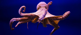
It was during this time that Urusla had a revelation. She of course was the sea witch from the original story and in various versions of the current tale was described as Triton's sister. Apparently she had been banished for trying to take over the kingdom, something not appreciated by the current king. As such she was a mermaid herself and was drawn in that direction. Patty and I had been watching a Jacques Cousteau special presented by National Geographic on TV and that night it was all about the octopus.We watched transfixed as the creature skulked along the ocean floor. Later in a laboratory we were really amazed as the octopus unscrewed a lid to a jar to get some food and then climb out of her aquarium, drop onto the floor and attempt an escape.

I got on the phone and called Musker.

Unfortunately I couldn't be around long as I had to leave by noon everyday  and head over to Disney Television to work on Ducktales,  then leave to go home at 5:00 to work on Mermaid concepts at home.
DuckTales concept art
Those were incredibly full days and to top it off, my wife Patty was pregnant. This lasted for a few weeks until I was called by Peter Snyder who was a new management person at Features. He told me I had to choose a film project to work on because they needed a full time Art Director on Little Mermaid. Patty and I left on a trip to unwind before the beginning of another big film. As she was 8 months pregnant, we also wanted to get out one more time before the birth of our first child. We planned stops at places like the Monterey Bay Aquarium to gather some reference along the way. Nothing was planned, we just got in our 4-wheel drive and blew out of Burbank early one dark morning.

The original development team on Little Mermaid
I went over to the Ink and Paint building to check in. Many of the familiar faces I had know before were now gone. The current administration seemed to like to hire management heads that had no artistic background or animation experience. Disney paints at this time were actually milled, yes milled, in the Ink and Paint building. You could call up and order, " I'm running low on Witmer Red." and they would send some over or you could go over and pick it up yourself. That hue by the way was named in honor of a wonderful and gracious background painter by the name of Thelma Witmer.

They hired a new guy to head up Ink and Paint who had a background in chemistry. His first act to modernize was to get rid of the agent Disney Studios had used since they began to stabilize the paint. The agent was formaldehyde bcause it was now labeled a toxic substance. I asked, "But you still have the pigments, right?" There was a quiet pause. His face kind of scrunched up slowly as he realized he had needlessly thrown out decades of Disney pigments collected from around the world along with the paint. I went back to John Musker and told him about the paint issues. We wound up ordering paint from Cartoon Colour for our cel paints instead of using our own for the first time in studio history. Ironically about the only cels were ever painted using true Disney paint from the old formula and those were concept setups or color models I did at the beginning with my own set at home. Mermaid was also the last feature done by Disney to use hand painted cels as from Beauty onward the process became a digital one.

Alan and Howard
My daughter Kim was born during the beginning of the pre-production phase and she was a flaming, and I mean flaming redhead. That fact definitely contributed to Ariel's red follicles as it was mentioned by quite a few of the crew at the time. Unfortunately the leading contender for hair color was a blonde version based on Jeffrey's favorite super model Christie Brinkley. I argued to John and Ron (and eventually Jeff) that since so much of the film was going to have Ariel against blue and turquoise, that we needed to contrast it so our main star would stand out. I then showed the guys some pastels, watercolors and even cel mockups that my wife Patty (who was hoping to be color model) painted and they were both supportive of the visuals and my spiel. We had a meeting with Jeffrey when we moved back across the street from the trailers and he was not exactly sold on the red hair but my argument and visuals made sense so he said OK. Glen Keane took the idea and really ran.. or swam, with it creating some really beautiful designs with our rough versions of Ariel donning red hair that now led the way.

Meanwhile, "Oliver and Company" was being groomed as the-hit for Disney Animated Features and they had pretty much taken over the main warehouse space on Flower Street in Glendale where management had relocated animation to from the old main lot. Roger Rabbit had part of their American crew working across the street in another warehouse. We had our offices across the street in a group of trailers that were arranged in a bug connecting square.

One major thing we had in our favor with Mermaid is that with the other two big budget animated films in production, our little film was flying under the radar. That really gave all of our creative juices a chance to flow like the old days. We had a real music room for the first time in ages during "Mermaid".

My room was across from the room Howard and Alan used whenever they were in town. It was exciting to hear them working out new songs while tweaking the ones they had already written. Howard would ask me to come in and listen to their latest tune and then give  me a cassette of the performance to take back to my room to enjoy. My room was adorned with undersea souvenirs from Nautilus shells to huge conch shells to starfish, even a huge collection of coral and (plastic) seaweed. I set up a light that played over a revolving core of aluminum foil that projected an underwater feel onto the walls when the room was darkened.  An old live-action film gimmick that I had learned from my old friend and former teacher Ken O'Connor.

Early concept drawing
For relaxation breaks during Little Mermaid we had lots of choices. We had ping pong tables, radio controlled cars in the parking lot, lazer tag and bowling besides other treats. For lazer tag we turned off the main ceiling lights at the main complex across the street to get the cubicle area nice and dark, the we ran, jumped knocked over trash cans on our way to becoming action heroes of sorts.

We also had a full size bowling alley adjacent to our trailer compound and a few of us would sneak over to bowl a couple rounds before stealthily returning to our desks. Management wasn't keen on people away from their desks and if they had their way they some would have barred breaks of any kind but it was difficult for them to watch all of us, and we had the union protecting us. What they didn't realize then and a few never will is that it gives a chance to blow of a little steam besides promoting teamwork and a chance to unwind for a few minutes. One side note, if Rob Minkoff tells you he's not much of a bowler, don't believe him. "Gee, these bowling balls are heavy." "Is this how you hold it?" "Oh my, did I just bowl a perfect game?" Rob, you make me sick.

Pastel concept artwork for Disney's Little Mermaid by Art Director Mike Peraza
I wanted the beginning to look more sepia and umber so that when we transition to the magical underwater kingdom it would have more of an impact. I wanted the world of man while not to be one of smog and pollution yet to still be desaturated when compared to the world under the sea.

Eric's Castle concept Mike Peraza
Eric's castle was a mediteranean theme and I designed it as a thick broad collection of shapes with straights infused throughout. Again this was to contrast the undersea structures that I wanted to be whimsically thin and full of curves in an Art Noveau attitude. Ursula's domain was a big disappointment to me as I really wanted something that had more of a feeling of a skeletal remains of a sea dragon twined around a thin mountaintop until you reached its open mouth at the bottom. What we ended up with was a committee design monstrosity.  the interior however was one that I got to use without any changes.

Ursula's Domain concept designed by Mike Peraza
I showed John and Ron some charcoals and pastels I did usiung Portugese man of war tenacles as sort of curtain material and the polyps as a shag carpet.  I wanted her to live inside a shell budior where she could ooze out of it like some kind of slimey creature. John and Ron were supportive and let me run with it. This was to be amidst undersea volcanoes. As usual back in those days, asking for effects was a tough battle and I was usually on the losing end when arguing with the management of that day. 

Kelly Asbury had done some very nice studies of how the village married with water for example, waterwheels, Venice type canals. I put those and also ideas from Rowland Wilson into a shot that was to be a multiplane reminiscent of the magnitude of Pinocchio. We were watching dailies and when that rough black and white test came on the screen, it garnered applause, which was high praise coming from that audience. Before we could go further with it however, that section was cut drastically along with other sections from a decree from management to trim back. I don't think a film has to be one long nonstop chase or adventure and I like the lulls and breathing room that a few beauty shots can buy the film. Management stood firm. Luckily with John and Ron's eye, the cuts were made but the movie still worked.


Kay Nielson's stunning pastel & charcoal concept art for Little Mermaid 1930s
Disney had tried making "Little Mermaid" as far back as the late 1930 and we looked at what had been created from the Disney Morgue (Oops, they call it something like,"Animation Research" nowadays). Leroy brought out some pieces that illustrator Kay Nielson had drawn in charcoal and we were immediately drawn to a couple of pieces that showed a ship silhouetted again a lightning flash while cresting a huge wave. They were inspiring and we used his staging for that very scene in the film 50 years after the fact! The story department was solid with talented new additions Roger Allers, Tom Enriquez and Gary Trousdale along with veterans like Ed Gombert.


The Mermaid wrap party was a first rate bash with an Under the Sea theme at the Beverly Hills Hotel. As usual, it was nice seeing familiar faces again. We were greeted just outside the ballroom by Roy Disney and his charming wife Patty. Roy and I had a chuckle over our two Pattys and then we were off getting some seafood at the buffet. It always seemed ironic to me that here we were celebrating The Little Mermaid's completion by eating so many denizens of the deep from oysters to shrimp and yes even crab meat. If Sebastian only knew. Wonder what our crustacean friend would say... hey come to think of it, I didn't see him there! (Gulp)


Friday, March 12, 2010

Remembering Don Griffith


Don Griffith was the head of the Layout Department at Disney Studios for many years and the de facto Art Director from from the mid sixties on through the seventies. In addition during the 1970's, he helped usher in a young group of kids hungry to learn the tricks of the trade from this master. I had a special affection for Layout as it was explained to me by a teacher at Cal Arts, Ken O'Connor. Layout was the area where the film was staged, where the setting was designed to best portray the character and further the story with specific background design. Ken had recommended me to Don and I was flattered to be able to work with him. Don had been Ken's assistant once upon a time many years ago during Pinocchio.

Don was born on February 3, 1918 in Montana. His dad had passed a way when he was a boy and his mom moved the family to Hollywood where she operated a boarding house. He got a job at 19 after interviewing with Walt at Hyperion. He moved over to the Buena Vista address where he met a bubbly secretary named Kay. They married and had a lovely daughter Dolores.

The first day I arrived at the studio, Don took it on himself to show me around. He took me out to what was then one of the Disney Studio watering holes I believe was called El Chiquito Restaurant across from Warner Brothers Studio. We all just fondly called it, "El Sloppo's". Don held court in the corner booth as our regular waitress, Madge kept the glasses and the chips filled as we balanced spoons on our noses along with shot glasses on our heads to gain her attention.

"Rescuers" had just finished and I was put into production immediately on, "Fox and Hound" with a sideline stint doing concepts on new film proposals that never got the greenlight. Frank Thomas and Ollie Johnston had done some of their usual sparkling personality animation with the young fox and the puppy playing around the old watering hole, not knowing that they weren't supposed to be friends. The morality tale was heartfelt as the animation and I loved being able to work with Don on those scenes and many others. He really took me under his wing and showed me some great techniques and general approaches to laying out scenes he had gleaned over the decades on movies from Pinocchio all the way to Rescuers. Don, like many of the Disney guard, was a very patient and generous person. He could take a drawing I had tried to instill some strong staging into but was still lacking something and make it work. I knew I could always ask his advice with nothing but positive feedback from his lips. He would take my sketch and place it on his scene planning board. With an overlay of vellum and an occasional cigarette ash, he would proceed to add just a bit here, tweak a bit there, and voila, it looked like a masterpiece!

He handled everyone there at the studio with kindness and respect and they in turn reciprocated that same outlook to him. I can't state clearly enough that Don Griffith was one of the key Art Directors at Disney over his over 50 year time at the mouse house. His sketches from Hook's ship and Neverland or his ink drawing from 101 Dalmations and Winnie the Pooh are breathtaking in their beauty, clarity and key use within their prospective films. Famous scenes such as the meatball dinner in "Lady and the Tramp" were also Don's setups. He was one of those fellas who flowed liquid talent from their pencils and we were all very sorry when he finally retired.

Some good friends getting together to appreciate a great guy.
The studio wanted to throw a huge retirement party and kept after him but Don wanted nothing of the sort, being the humble guy he was. My wife Patty and I however did something about that. We threw an intimate Retirement Party for the "Griff" with old friends like Jack Hannah, Ken O'Connor, Ray Aragon, Dick Lucas, Ed Gombert,  Mike Hodgson and many others in our backyard.  They enjoyed a boisterous and funny roast along the lines of the old TV show, "This is Your Life" with guests first "appearing" as voices on an offstage microphone as Don sat listening and laughing. The guests enjoyed dinner amidst lifesize plywood cutouts I had created of Walt Disney's "Alice in Wonderland" including the teaparty sequence Don had layed out. I'll have to get those pictures (and video) out and post them when I can find them.

Don checking out Santa's (Mike Peraza)
sack of toys while Roxie eggs him on.
A lot of the Disney vets lived by the adage, "He who dies with the most toys wins!" Don's warm corner at the old studio was chock filled with toys, puzzels, gags. That sense of fun carried over into endless rounds of Uno and other card games between the Griffiths and Perazas and any hapless guests who stumbled into the fray over at their house on Friday nights. Sadly Don passed away on February 9, 1987.
He also left us with the admiration of all lucky enough to know him.

Welcome

I am honored to have worked with every character in this image
At the behest and downright good natured pushing of some close friends who I know mean well, I am embarking down this road know as blogging. I'm going to be posting personal photos from my time at Disney Studios along with stories of those wonderful days that although now gone will fondly be remembered by those of us who were there and possibly by the curious who are looking for a peek inside yesteryear when the pixie dust was created by hand and heart. I will also include memories of my stints with Warner Brothers, Don Bluth and MGM Studios.

As Isaac Newton once remarked,"If I have seen a little further it is by standing on the shoulders of Giants." That phrase more than any other comes to mind when realizing how fortunate we are to have worked with talented veterans of the animation business. I will always owe what career I may have to enjoy to the generosity of so many kind and wildly talented artists. Those "Giants" were the foundation or "shoulders" for so many of us that gained opportunities in the 1960's through the 1970's. I hope I can help some new faces out there get to know those people just a little better and maybe hoist them up on those very same shoulders as they traverse their own path. I have been invited to join the Disney Fine Arts program and part of my proceeds from sales will go towards Epilepsy research.

I invite old colleagues and new acquaintances to come aboard and share artwork, photos and tales of a time gone by.


Disney Fine Art announces latest works from Disney Art Director Mike Peraza